Data quality Kenya
Post by Sebastian Andreasen and Oliver Brandt . Published: June 30, 2020.According to Worldometers Kenya has a population of more than 53.5 million people with a smartphone penetration of 21% according to Newzoo’s 2018 Global Mobile Market Report. The 2020 penetration is likely to be higher, but in general the low penetration is affecting the representativeness of the Kenyan population in the data, which should be kept in mind throughout the investigation.
This relatively low amount of smartphones means that only a low amount of data for each tile and each timestamp can be found, which makes the conclusions less representative. In addition, the smartphone users have to use FaceBook as well, which is not necessarily the case for all users.
Movements in Kenya during lockdown
Movements in Kenya throughout entire period

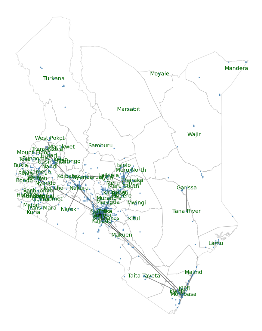
The above map shows all links between both tiles and administrations in Kenya over the period of 6th of April to the 25th of May. It can be seen how the movements mostly are centered around the greater cities, but bear in mind that a link only is presented if 10 people or more have moved from a tile or administration to another and have stayed there for the greater part of an 8 hour interval,for this reason the number of people moving around is further investigated.
The average baseline movement pr. tile is 93, which seems relatively high, but by looking at the quantiles it can be seen that data is a lot less scarce.
Baseline Quantiles
- 25%: 14
- 50%: 24
- 75%: 57
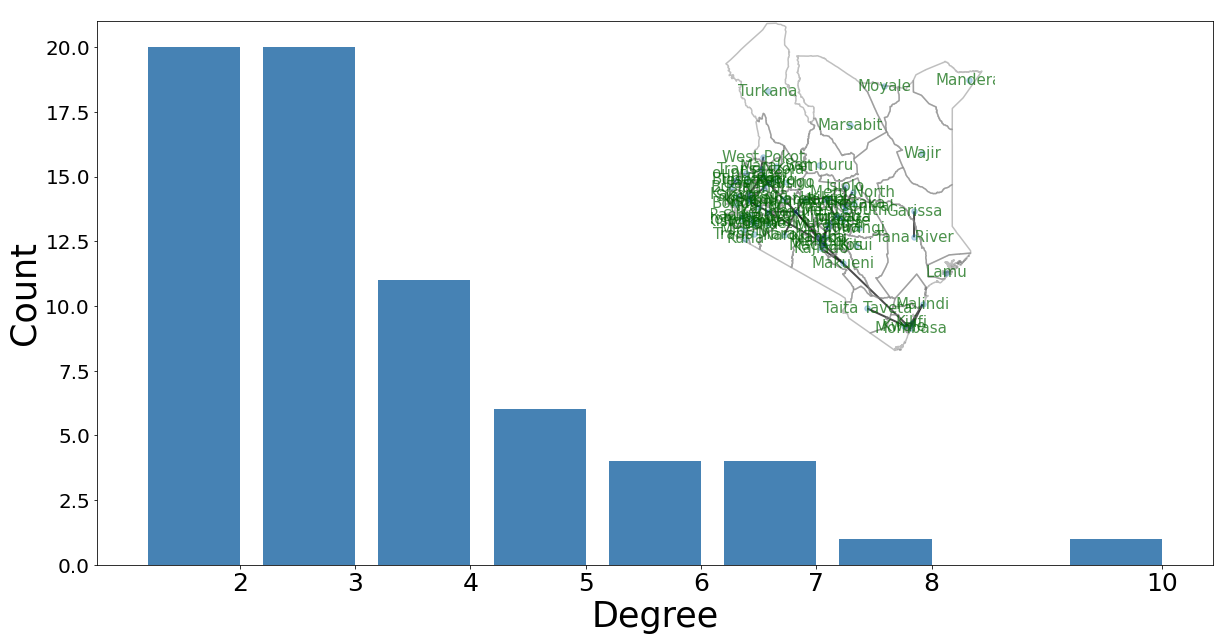
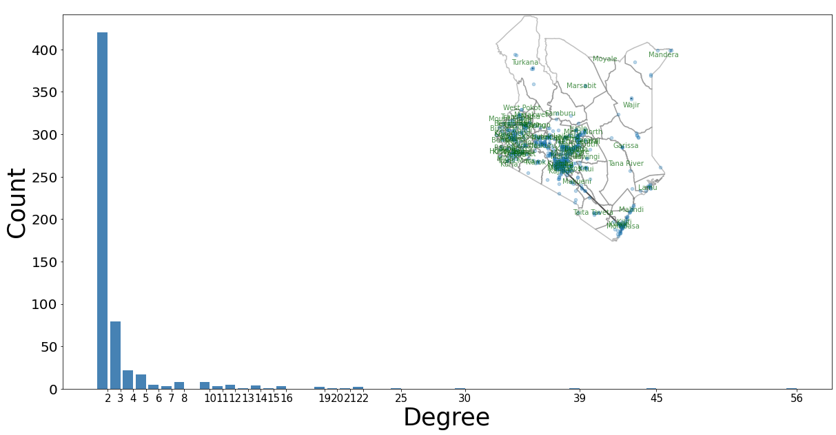
This shows that not a lot of movement can be detected. This can also be seen in the following plots, where the network degree on both tile and administration level is shown. Keep in mind that these networks show a representation of all movement throughout the entire period.
Degree admin level:
 Degree tile level:

As it can be seen on the plots most activity is centered around the larger cities, for this reason a greater focus is put on these in the visualizations.
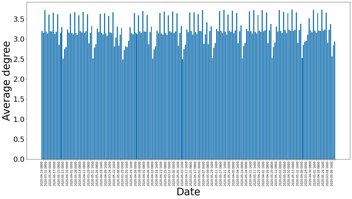
Despite the scarce data one would maybe expect the degree to decrease over the period, but this is not the case.
Average degree for each time-slot:

The average degree seems to stay more or less constant over the period, which can be explained by the fact that during the entire period the country has been in lockdown.
Population
The data also contains information about the population size in each tile and in the plot below it can be seen that data is mostly centered around the larger cities.
- On average each tile has a population of 106.
- On average 2024 tiles are populated.
- On average each time-slot has a population of 214.544 people*.
*The above has been calculated by taking the average baseline for each time-slot and multiplying the number with the average number of tiles for each time-slot that had a baseline.
Population Kenya
Pupulation density map, tile level:
In conclusion as data is scarce the visualisations has mostly been focused on the larger cities.